Research Methods for Charts on Papal Citation Sources
 Dataviz best practices are not welcome here
An ongoing project of mine is analyzing papal documents by word count, paragraph count, and citation sources.
Given the traction my latest chart has gotten, I’m going to use that as an opportunity to explain my research methods in more detail.

Collecting
The Vatican posts the full text of all recent encyclicals, including all footnotes. Thanks to the way the footnotes are formatted, I can fairly easily copy/paste them to Excel, delete the blank lines, and insert a table. My table will have 3 columns: the footnote, the specific category (such as St. Augustine), and the broad category (such as Saints).
Describing
When I first started making these charts, this was the most difficult step. How do I neatly and consistently group these citations into logical categories?
Popes who are saints presented a particular problem. I could make “Popes” its own specific category, but then lose a level of granularity, e.g. being able to distinguish which popes were cited. I had already decided on a Saints category - that seemed obvious - but not all popes are saints. Pope Benedict XVI is still alive, so how would I handle that?
How to handle Church Fathers, many of whom are not saints, was a similar issue.
Any decision involved a tradeoff.
The categories I settled on were:
- The author of the encyclical: this includes self-citations, and editor’s notes
- Public figures: any person who isn’t a saint, blessed, or servant of God (like Thomas a Kempis), or any organization/text that wasn’t Catholic (like the Talmud)
- Saints: any saint, blessed, or servant of God
- Proceedings of the Roman Catholic Church: a catchall term that covers Pope Benedict, councils, synods, the Roman Curia, the Catechism, and similar official texts
Usually, several citations have more than one citation source, separated by a semicolon. I had to be careful with Pope Benedict’s citations, as he liked to include whole paragraphs for one citation. I give each source its own line; so for Fratelli Tutti, there are 288 numbered citations, but 303 sources.
To describe the citations, I go line by line, adding the broad category first, then the specific category. Sometimes, it’s faster to add all broad labels first, and then batch add the specific label (if it’s all from the same document).
I made a deliberate decision a while ago not to count Scriptural citations. I do have some charts that include Scripture, but it became obvious that this wasn’t fair. I have yet to find a significal papal document that doesn’t mention Scripture; whether it cites Scripture in the footnotes is a different matter. The only way to be fair is to read each document with a fine-toothed comb, especially since Scriptural references are not always consistent (for the Gospel of John, it might be Jn or John). This was not a good use of time, as it would not tell me something novel. I know that the documents will reference Scripture; I’m interested in what else they reference.
Visualizing
Now that each citation is described according to my taxonomy, I can work on visualizing it.
I freely admit that my charts break some ‘best practices’ for data visualization, such as number of recommended columns per chart. My only defense is that my audience was mainly myself, and I did not anticipate garnering much interest with other readers.
The fastest way to build my columns is to make a pivot table based on the table with all of the citations. There may be some iterative work as I jump between tables, because I realized that I missed two identical sources that had slightly different names, or I had a saint in the wrong broad category.
Now, I create a clustered column chart. The first draft of this table is to make sure my data is correct. Once I have the chart, I can fine-tune the elements. I try to keep the X axis as simple as I can, since I’m including so many data points. For example, if I have popes who are also saints, I only use “Pope” as part of their name. It is the more unusual title of the two, and the “saint” is implied in the category name (also visible on the lower X axis). This, again, is a tradeoff - I could also drop all instances of “saint,” but I’d still have to include blesseds and servants of God.
I use the same font and color palette for each chart, which can be a significant time investment. It’s worth it for the continuity of the images.
Double-checking
At this point, the chart is mostly done. I go through the citations at least once more to find possible mistakes. In the case of the chart for Fratelli Tutti, I found a few mislabeled citations (that ultimately only slightly changed the final counts), and a typo (editori’s note? really?). The big mistake I caught was that I mislabeled Evangelii Gaudium (Pope Francis) as Evangelium Vitae (Pope St. John Paul II, Saints)
Observations
I try to keep my own commentary out of the charts, and to let it speak for itself. Citation analysis is not the only, or even the most important way to analyze a text. It is useful to notice broad strokes, or abrupt changes.
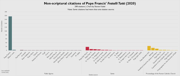
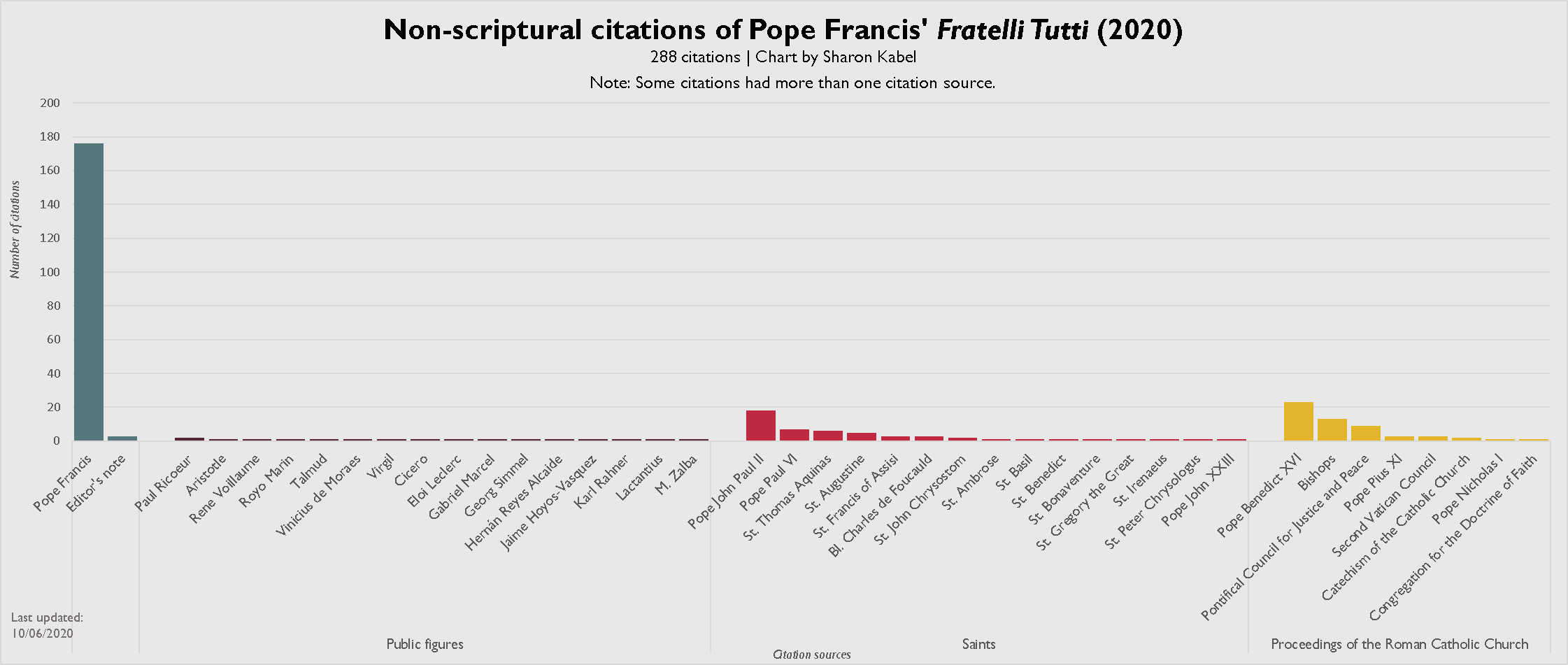
For Fratelli Tutti, the obvious and dramatic item of note is the number of self-citations.
Here is the breakdown of the 303 citation sources per broad category, rounded to whole numbers:
- Pope Francis himself: 176 (58%) ** Editor’s notes: 3 (>1%)
- Public figures: 17 (6%)
- Saints: 52 (17%)
- Proceedings of the Roman Catholic Church: 55 (18%)
Self-citation in itself is not necessarily bad, but it is a controversial topic. A self-citing rate of almost 60% - three of every five citation sources - is at minimum noteworthy.
Context is also important. Post-synodal documents, for example, are likely going to cite the synod most frequently. An encyclical on Dante is going to cite Dante a lot.
Within the self-citations, there is some diversity. A documentary on Pope Francis is referenced three times, as are video messages sesnt to TED Conferences. Encyclicals and exhortations are present, but the majority of self-cites are from addresses, speeches, homilies, and other similar events. I did try to make a chart just of the self-cites, but 176 data points are awfully hard to visualize in a helpful way.
I settled on a word cloud of the 59 most commonly used terms, with words like months and locations removed:

We can see that he references two of his documents, Laudato Si and Evangelii Gaudium, quite a lot. More surprisingly is the number of references to addresses to the Diplomatic Corps, and civil leaders or authorities.
Conclusions
Because this document is an encyclical, at some point I’ll need to update the series of charts I have that compare word/paragraph counts for encyclicals. Otherwise, this is about as much grist as I can fairly get solely from a citation analysis.